Order Goal
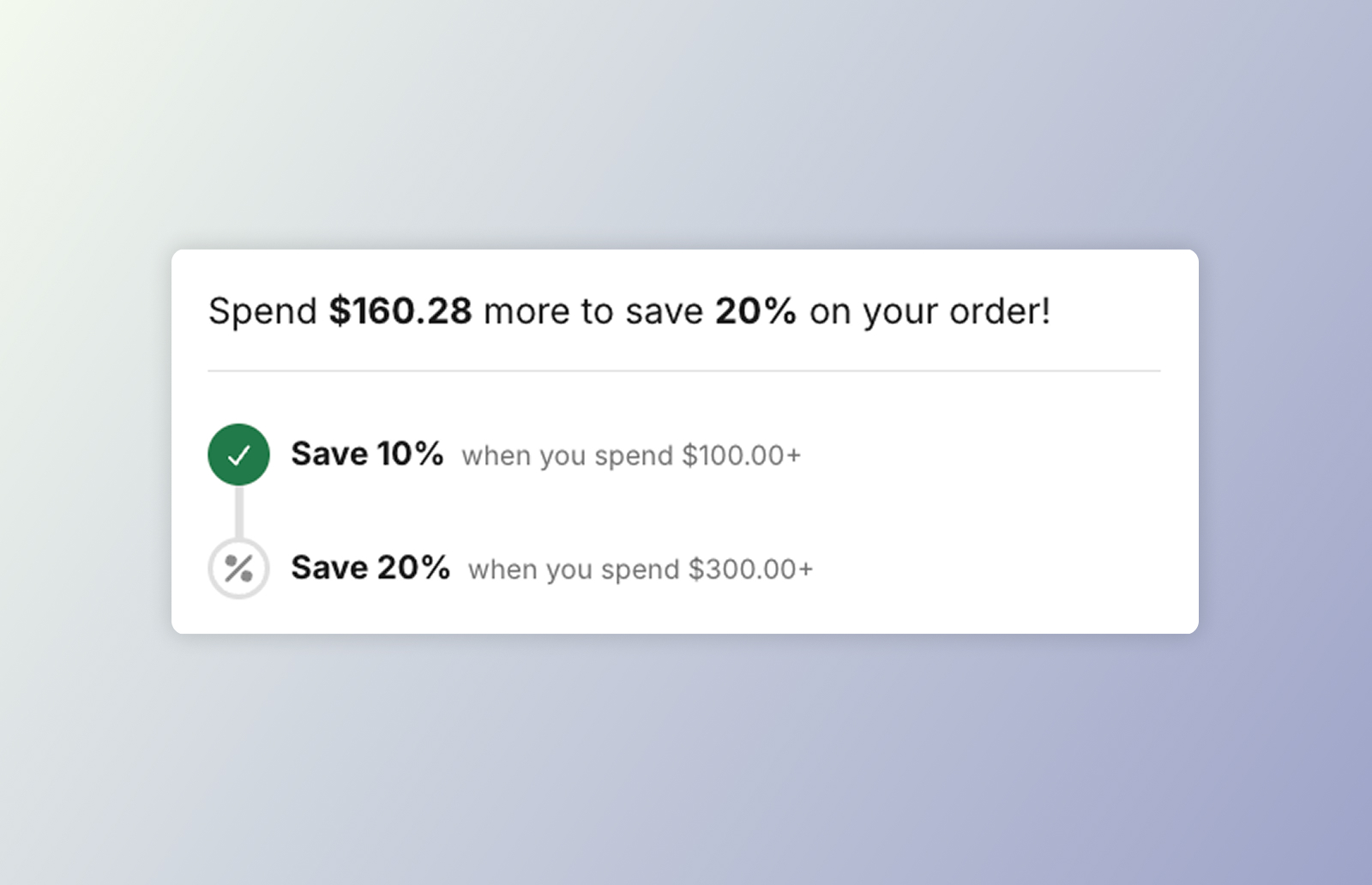 DKL Order Goal component - layout: stacked
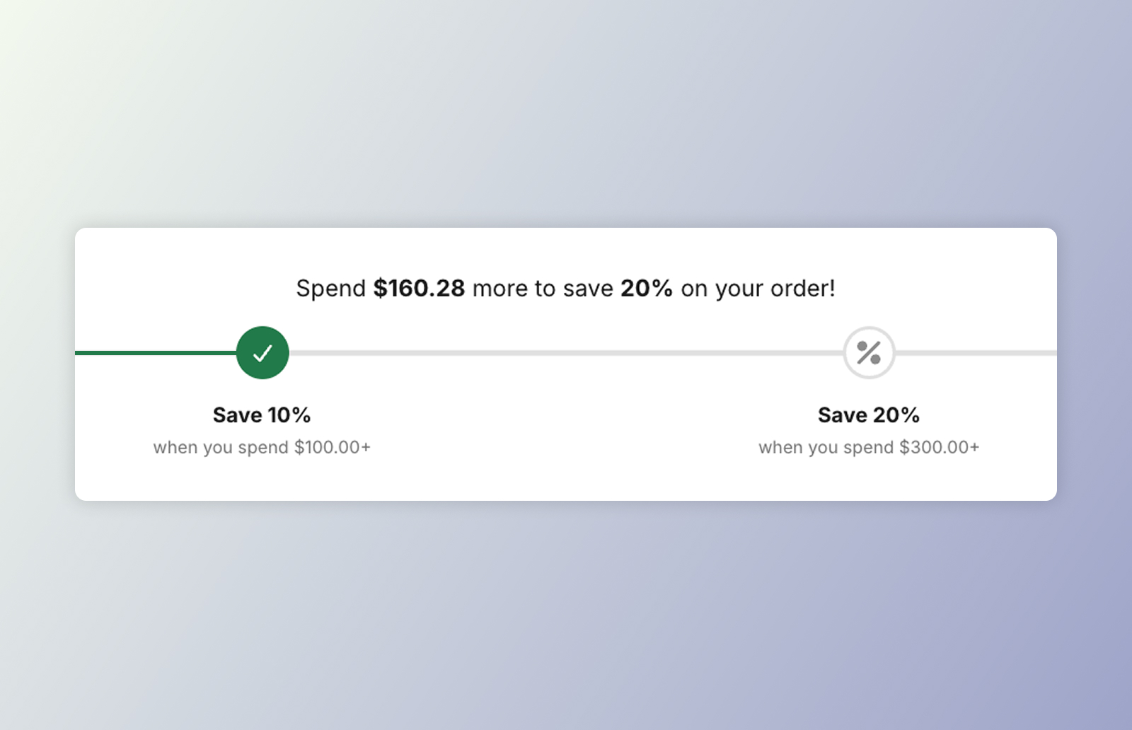 DKL Order Goal component - layout: horizontal
<dkl-order-goal> shows progress toward an order-goal discount’s spend tiers from the
cart’s items subtotal: a progress track, evenly-spaced tier markers, and a “Spend
[amount] more to save [discount]” message that flips to a success heading once every
tier is met.
It’s a light-DOM component (like the discount badge) — no shadow DOM and no CSS parts. The Liquid snippet server-renders the full UI so it paints server-side, and the component re-renders in place on cart updates — recomputing the progress fraction, marker states, and message locally, which keeps it theme-agnostic.
On this component
Section titled “On this component”App blockAdd DK: Order Goal in the theme editor and configure it with settings — no code.
Web ComponentsDrop dkl-order-goal straight into your theme's Liquid and configure with data-*.
Styling & Data AttributesThe data-* attributes, --dkl-og-* styling tokens, and Light-DOM classes shared by both.
EventsThe tier-change event dkl-order-goal emits.
Accessibility
Section titled “Accessibility”- Progress bar semantics. The track carries
role="progressbar"witharia-valuemin,aria-valuemax,aria-valuenow, and a money-formattedaria-valuetext(e.g. “$40.00 of $100.00”), so assistive tech reports real progress toward the goal rather than a bare percentage. - Live progress message. The “Spend [amount] more…” headline (and the success message)
is an
aria-live="polite"region, so it’s announced as the cart total changes. - State beyond colour. Met tiers are marked with both an
--activeclass and a check icon, not colour alone. Keep--dkl-og-progress-colorand the marker colours at sufficient contrast when restyling.