Volume Picker
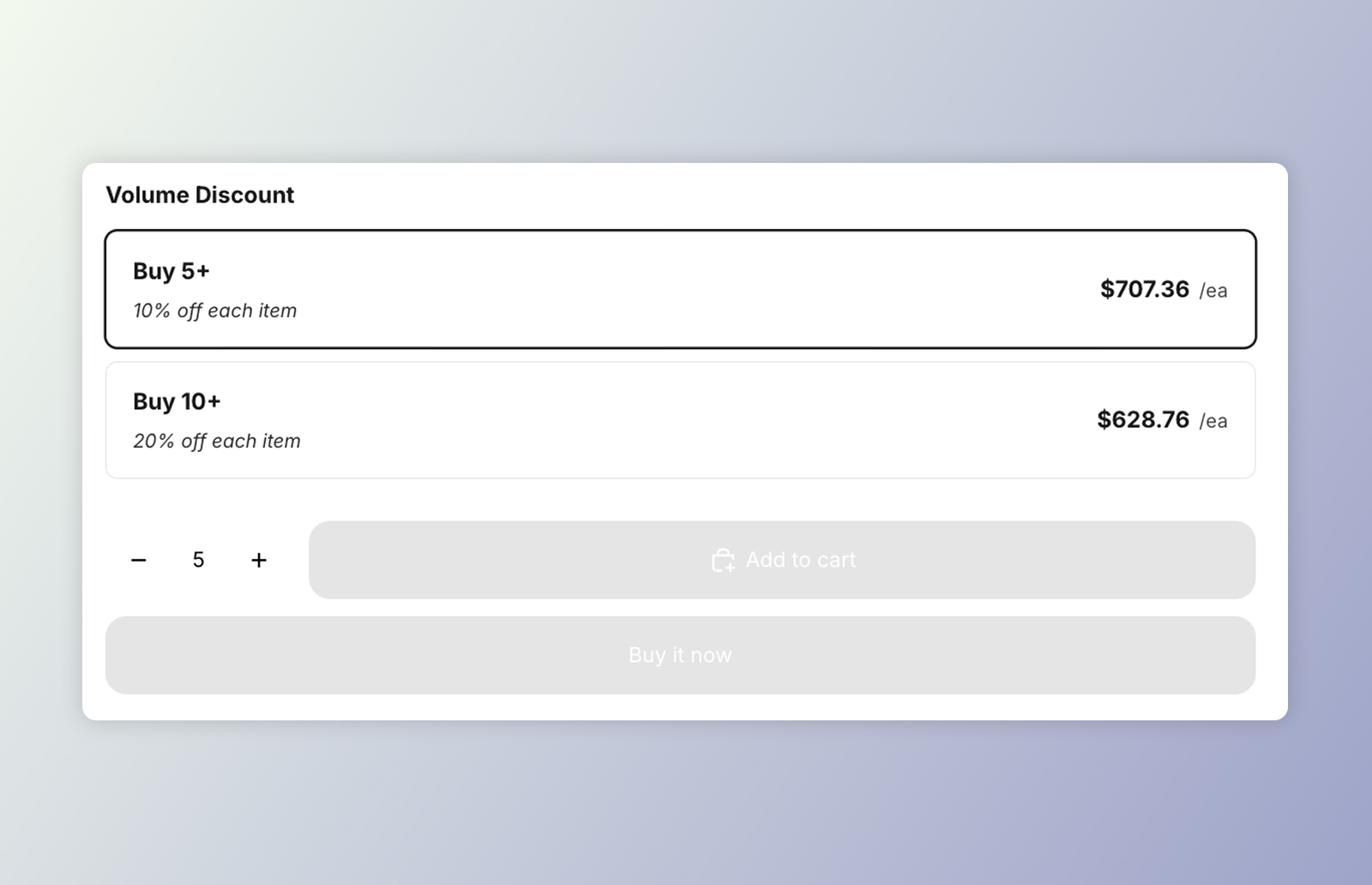 DKL Volume Picker component - layout: cards
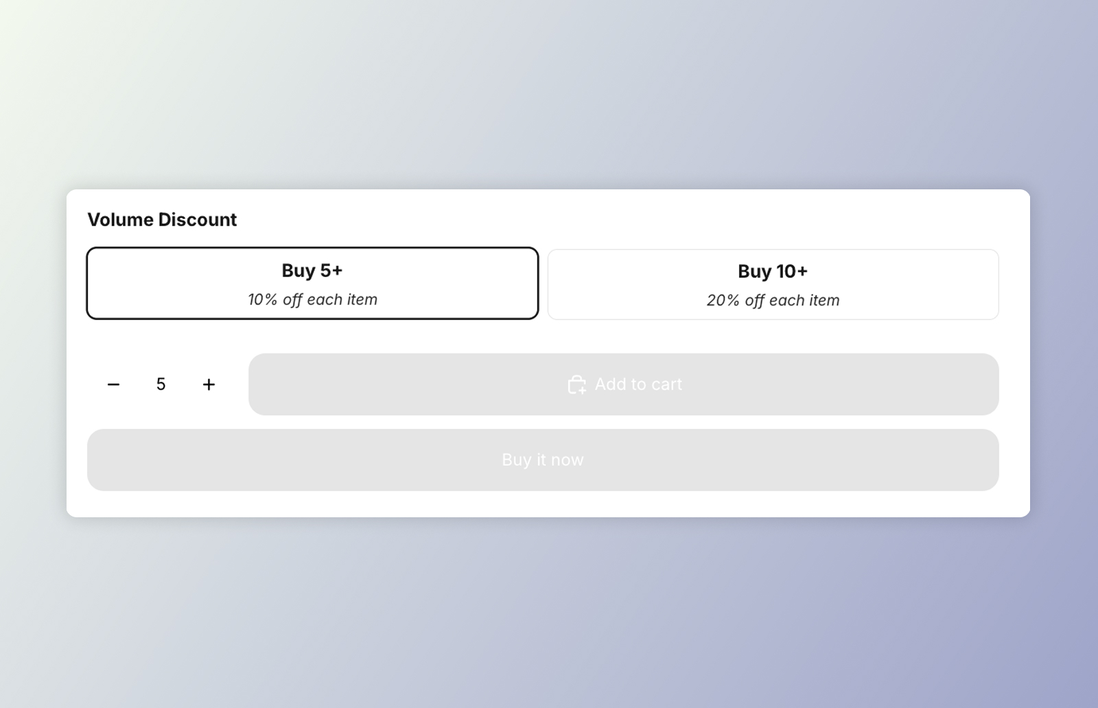 DKL Volume Picker component - layout: mini-buttons
<dkl-volume-picker-radio-groups> is a product-page selector for volume discounts. Each
tier (“Buy 3+”, “Buy 5+”…) is a radio card. The radio inputs live in light DOM so they
join the product form, and project into the component’s shadow DOM through a <slot>; the
shadow holds the title and layout.
Selecting a tier:
- emits
discount-kit-live:volume-discount:tier-change, consumed by<dkl-price>; - optionally updates the theme’s native price element (when enabled), drawing the discounted unit price with a synthetic strikethrough;
- optionally syncs the theme’s quantity selector to the tier’s quantity.
Tiers (quantity, discount type/amount, pre-computed unit price) are server-rendered onto
each radio as data-dkl-* attributes, which the component reads.
On this component
Section titled “On this component”App blockBuild the picker in the admin and place it with the Component block — no code.
Web ComponentsDrop dkl-volume-picker-radio-groups straight into your theme's Liquid and configure with data-*.
Styling & Data AttributesThe data-* attributes, --dkl-* styling tokens, CSS parts, and light-DOM classes shared by both.
EventsThe tier-change event dkl-volume-picker-radio-groups emits.
Accessibility
Section titled “Accessibility”- Native form semantics. Each tier is a real
<input type="radio">wrapped in a<label>, grouped in arole="radiogroup"inside a<fieldset>/<legend>. So keyboard users get native arrow-key navigation between tiers, the whole card is a click target, and the selection participates in the product form. - Labelled group. The radiogroup is labelled by the title (
aria-labelledby), falling back to anaria-labelof “Volume discount options” when no title is shown. - Unavailable tiers are disabled. On a sold-out or excluded variant the tier inputs
render
disabled, so they’re skipped in the tab/arrow order rather than offering a dead-end selection. - Selection announcements. Selecting or clearing a tier is announced through a managed
aria-liveregion (“… selected” / “Volume discount removed”).