Styling & Data Attributes
This is the shared reference for <dkl-price> — the data-* attributes that drive its
behaviour, the --dkl-* tokens that style it, and the CSS parts you can target. The app
block settings map onto these; on a web component you set them directly.
Data attributes
Section titled “Data attributes”All optional. The price itself, the compare-at and the money format come from the carrier, so only the attributes you set are listed.
data-show-savings
Section titled “data-show-savings”"true" | "false" · default: false
Show the savings badge (saving versus the original / highest price).
data-savings-format
Section titled “data-savings-format”"percentage" | "amount" · default: percentage
How the savings badge displays the saving.
data-savings-label
Section titled “data-savings-label”string · default: Save
The badge’s leading label, e.g. “Save 15%”.
data-savings-extra-label
Section titled “data-savings-extra-label”string · default: + an extra
Connector between the sale saving and the tier saving, e.g. “Save 10% + an extra 15%”.
data-dkl-discounted
Section titled “data-dkl-discounted”presence · default: unset
Set by the component while a tier is active — a styling hook only. Don’t author it yourself.
CSS styling tokens
Section titled “CSS styling tokens”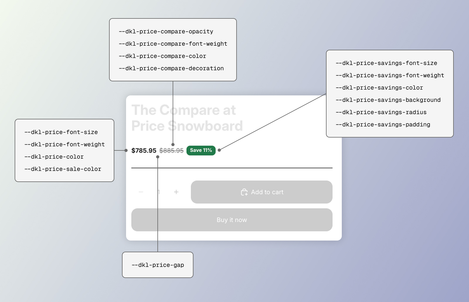
CSS styling tokens for the DKL Price component
<dkl-price> has no shadow <style> — its stylesheet (loaded site-wide by the embed) is
the single source, styling the host and parts. Set any token above the element (:root,
the Custom CSS in Components → Styles, an inline style, or the block’s scoped rule).
--dkl-price-gap
Section titled “--dkl-price-gap”default: 6px
Gap between price and compare-at.
--dkl-price-font-size
Section titled “--dkl-price-font-size”default: inherit
Font size for the main price and compare-at (the savings badge has its own token).
Explicit sizes don’t follow the browser’s default-font-size setting (the theme’s own
size, which inherit tracks, already does). --dkl-price-font-size-mobile overrides it at
≤768px — what a component entry’s mobile size emits.
--dkl-price-font-family
Section titled “--dkl-price-font-family”default: inherit (→ --dkl-font-family)
The font family for every part. Only renders if your theme loads that font.
--dkl-price-font-weight
Section titled “--dkl-price-font-weight”default: 600
Main price font weight
--dkl-price-color
Section titled “--dkl-price-color”default: inherit
Main price color
--dkl-price-sale-color
Section titled “--dkl-price-sale-color”default: var(--dkl-price-color)
Main price while a tier is active ([data-dkl-discounted]).
--dkl-price-compare-opacity
Section titled “--dkl-price-compare-opacity”default: 0.6
Struck-through compare-at opacity
--dkl-price-compare-font-weight
Section titled “--dkl-price-compare-font-weight”default: 400
Compare-at font weight
--dkl-price-compare-color
Section titled “--dkl-price-compare-color”default: inherit
Compare-at color
--dkl-price-compare-decoration
Section titled “--dkl-price-compare-decoration”default: line-through
Compare-at text decoration
--dkl-price-savings-font-size
Section titled “--dkl-price-savings-font-size”default: 13px (12px at ≤768px via --dkl-price-savings-font-size-mobile)
Savings badge font size
--dkl-price-savings-font-weight
Section titled “--dkl-price-savings-font-weight”default: 600
Savings badge font weight
--dkl-price-savings-color
Section titled “--dkl-price-savings-color”default: #ffffff
Savings badge text color
--dkl-price-savings-background
Section titled “--dkl-price-savings-background”default: var(--dkl-color-success)
Savings badge background color
--dkl-price-savings-radius
Section titled “--dkl-price-savings-radius”default: var(--dkl-radius)
Savings badge corner radius
--dkl-price-savings-padding
Section titled “--dkl-price-savings-padding”default: 2px 8px
Savings badge padding (vertical and horizontal)
Also reads the global brand tokens --dkl-font-family and --dkl-color-text.
CSS parts
Section titled “CSS parts”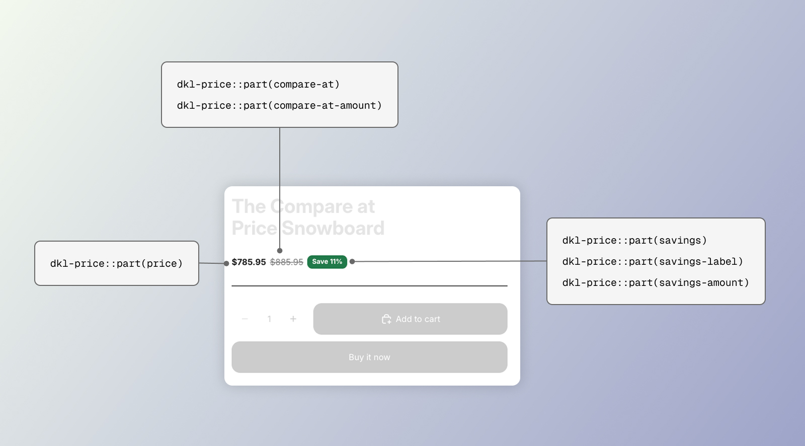
CSS parts for the DKL Price component
<dkl-price> is fully shadow DOM. Target its internals with ::part().
CSSPart
The main price (the discounted price while a tier is active).
compare-at
Section titled “compare-at”CSSPart
The struck-through compare-at wrapper.
compare-at-amount
Section titled “compare-at-amount”CSSPart
The compare-at number.
savings
Section titled “savings”CSSPart
The savings line wrapper.
savings-label
Section titled “savings-label”CSSPart
The savings label text.
savings-amount
Section titled “savings-amount”CSSPart
The savings amount.
Examples
Section titled “Examples”:root { --dkl-price-sale-color: #c0392b; --dkl-price-compare-opacity: 1; --dkl-price-compare-color: #888;}dkl-price::part(price) { font-size: 1.5rem; font-weight: 700;}<dkl-price data-show-savings="true" data-savings-format="amount" data-savings-label="You save"></dkl-price>