Quickview
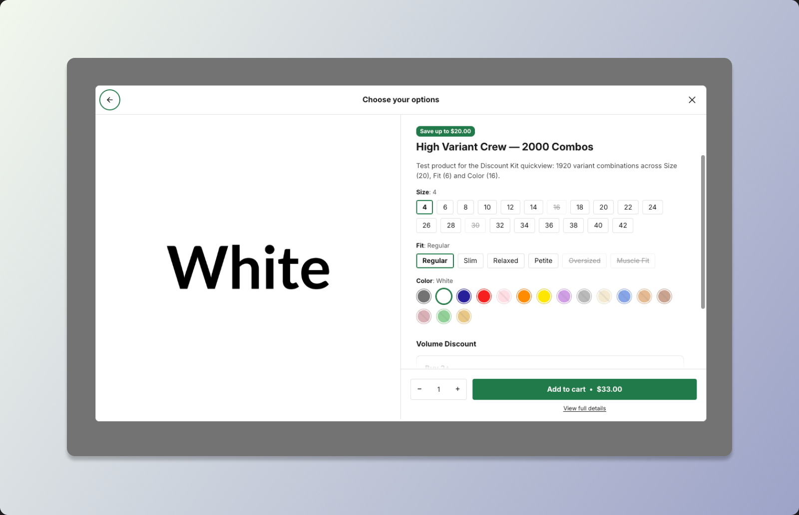 DKL Quickview component - panel: add to cart
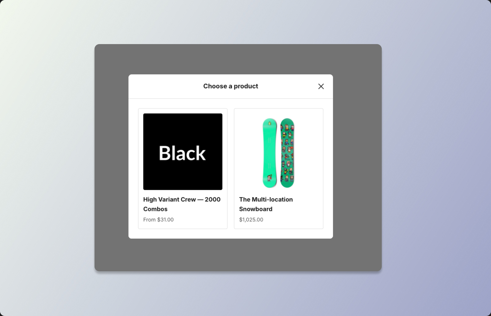 DKL Quickview component - panel: product selection
<dkl-quickview> is a product quickview dialog. Wrap any content — a button, a
product-card overlay, a text link — in a <dkl-quickview> trigger, and clicking it opens a
modal for that product: image, title, description, option pickers, a quantity stepper, and an
Add to cart button with the price inside it. Shoppers pick a variant and add it to the
cart without leaving the page they’re on.
The same dialog, opened in its selection mode, is the Gift Selector for gift-with-purchase discounts — documented separately, since it opens itself from the app embed rather than from a trigger you place.
Unlike the other components, the quickview doesn’t need a product page. A trigger can sit in a collection grid, a search result, a recommendation carousel, the cart page — anywhere. The dialog fetches the product itself when it opens (or reads it from your Liquid, with no request at all), so it works for any product on any page.
<dkl-quickview data-product-handle="awesome-tee"> <button type="button">Quick view</button></dkl-quickview>What the dialog does
Section titled “What the dialog does”- One dialog per page. However many triggers you place, there’s a single native
<dialog>, created on first open. Its contents are built when it opens and discarded when it closes, so a page of a hundred triggers costs nothing until one is clicked. - Instant opens. Triggers prefetch their product in the background as they scroll into view, so the first open renders as if it were server-side. A product card can also embed the product as a Liquid seed for a zero-request open.
- Real variant selection. Options render as radio-pill groups, or swatch chips for options connected to a colour metaobject. Combinations that don’t exist are hidden; sold-out combinations are struck through. Products with more than 250 variants are supported — every selection resolves to an exact price, availability, and image.
- Price in the button. The add-to-cart button carries the resolved price (“Add to cart · £33.00”), with the compare-at price struck through when the variant is on sale.
- The product’s volume discounts, inside the dialog. A Volume Picker per eligible volume discount mounts inside the dialog automatically — on by default, and nothing renders when the product has none. Selecting a tier sets the quantity and discounts the button’s price.
- Multi-product picker. Give a trigger several products and the dialog opens on a product picker screen first; choosing one slides to that product’s options. Going back restores whatever the shopper had already selected.
- Adds through the theme. Cart adds go through Shopify’s standard cart action when the theme supports it, so the theme’s own cart drawer or cart count updates as it normally would. Themes without it fall back to the Ajax cart API automatically.
- Desktop modal, mobile drawer. On small screens the dialog becomes a bottom sheet.
Ways to open it
Section titled “Ways to open it”| How | Example |
|---|---|
| Trigger element | <dkl-quickview data-product-handle="tee"><button>Quick view</button></dkl-quickview> |
| Any existing element | <a href="/products/tee" data-dkl-quickview="tee">Quick view</a> — no wrapping |
| JavaScript | await DiscountKitLive.openQuickview({ productHandle: 'tee' }) |
| Command event | document.dispatchEvent(new CustomEvent('discount-kit-live:quickview:open', …)) |
All four end in the same dialog. See Web Component for the first two and JavaScript API for the rest.
On this component
Section titled “On this component”Prerequisites
Section titled “Prerequisites”- The Components app embed — as for every component. It loads the dialog’s runtime and styles on every page (the trigger can appear anywhere, so unlike the product-page components its stylesheet is never deferred). See Enable the app embed.
- Product data. By default the dialog reads products through Shopify’s Storefront API using the app’s own storefront access token, which the embed exposes automatically. This gives swatches, market-correct pricing, and exact resolution for high-variant products. If the token isn’t available, the dialog falls back to the theme’s Ajax product endpoint.
- In-dialog discounts. The volume picker inside the dialog reads the same Discount Kit Live data as the page components, over the Storefront API. This needs Discount Kit’s storefront metaobject permission. Stores that installed the app before this permission was added are asked to approve it the next time they open Discount Kit in the admin; until then the dialog simply renders without discount widgets.
- Synced discounts only. The in-dialog widgets only show discounts synced to your storefront, exactly like the page components.
Products with 2,000+ variants
Section titled “Products with 2,000+ variants”The quickview is built for Shopify’s raised variant limit. Products with more than 250 variants — the point past which Liquid and the Ajax API return only a first page — work like any other:
- Every combination resolves exactly. A selection past the first page is resolved through the Storefront API by its option values, so the button shows the real price, availability and image for the variant, not a range.
- Option availability follows Shopify’s top-down rule. A value is hidden when no
variant combines it with the options chosen before it, and struck through only when
every such variant is sold out — the same behaviour as Liquid’s
product_option_value.availableand Shopify’s Horizon theme. A colour with one size left stays pickable; only that size’s siblings strike. The dialog computes this from the first page at once, then completes it from a lightweight availability index it loads in the background, so sold-out states show on open and refine a moment later. - Swatches and option lists are complete. Option values come from the product’s options, never from the variants, so a 2,000-variant product still renders every colour and size pill.
- The Gift Selector inherits all of it, including gift rules that permit only some variants of a high-variant product: the permitted options show at once, without waiting for the index.
On the Ajax fallback (no Storefront token on the page), a selection past the first page
still resolves — by the theme’s own product page, using Shopify’s granular option-value
URLs — but the button shows the product’s price range rather than an exact price, and the
variant-change event reports exact: false. Keeping
the app embed enabled, so the token is present, avoids this.
Accessibility
Section titled “Accessibility”- A native modal. The dialog opens with
showModal(), so the page behind it is inert,Esccloses it, and a click on the backdrop closes it. Focus moves into the dialog on open and returns to the trigger on close. - Focus stays inside. Tab on the last control wraps to the first and Shift+Tab wraps the other way, so focus never escapes to the browser chrome while the dialog is open. Each radio-pill group counts as one tab stop; hidden and disabled controls are skipped.
- Real form controls. Every option is a
<fieldset>/<legend>radio group, never collapsed to a<select>, however many values it has. The selected value is rendered inside the legend (“Size: 24”), so the group’s accessible name always carries the current selection. - Announcements. Variant resolutions (title, price, sold-out state) are announced through
an in-dialog
aria-liveregion — the page’s own live regions are inert behind a modal. - Triggers are keyboard-operable. A trigger with no interactive child (say, a bare
<div>overlay) is givenrole="button"andtabindex="0"and opens on Enter or Space. A trigger that already wraps a<button>keeps the button’s own semantics. Either way the opener is markedaria-haspopup="dialog". - Multi-product screens. Only the visible screen is reachable — inactive panels are
inert— and the dialog’s accessible name follows the visible screen’s heading. - Reduced motion. All transitions (fade, slide, drawer) are disabled under
prefers-reduced-motion.