Styling & Data Attributes
This is the shared reference for <dkl-volume-picker-radio-groups> — the data-* attributes
that drive its behaviour, the --dkl-* tokens that style it, and the CSS parts and light-DOM
classes you can target. The app block settings map onto
these; on a web component you set them directly.
Data attributes
Section titled “Data attributes”Set as data-* on the host. The tiers, prices and money format come from the carrier, so only
the attributes you set are listed; the behaviour toggles default off.
data-discount-id
Section titled “data-discount-id”metaobject handle · default: carrier (first eligible)
Which discount’s carrier to clone. The discount- prefix is optional; an attribute-less
tag uses the default (first eligible).
data-style
Section titled “data-style”"cards" | "mini-buttons" · default: cards
Presentation: stacked cards, or a compact button grid (the per-tier price line is hidden).
data-widget-id
Section titled “data-widget-id”string · default: null
Instance id; disambiguates multiple widgets.
data-update-price-on-change
Section titled “data-update-price-on-change”"true" | "false" · default: false
Whether selecting a tier updates the displayed price — the theme’s native price element and
the <dkl-price> component (via the tier-change event’s
updatesPrice flag). When false, the event still fires for custom integrations, but no
price display reflects the tier.
data-price-target
Section titled “data-price-target”CSS selector | "none" · default: auto-detect
Override or disable the price element target. Use "none" when pairing with
<dkl-price>.
data-sync-with-quantity
Section titled “data-sync-with-quantity”"true" | "false" · default: false
Sync the theme’s quantity selector to the selected tier’s quantity.
data-quantity-target
Section titled “data-quantity-target”CSS selector | "none" · default: auto-detect
Override or disable the quantity input target. See Quantity sync for how the target is auto-detected.
data-quantity-event
Section titled “data-quantity-event”event name · default: (none)
An extra theme event to also drive quantity sync, on top of quantity-selector:update.
The component reads the quantity from the event’s detail.quantity, or re-reads the form
input if absent.
data-exclude-sale-prices
Section titled “data-exclude-sale-prices”"true" | "false" · default: carrier (the discount's excludeSale)
Disable tiers when the variant is already on sale.
data-price-unavailable-label
Section titled “data-price-unavailable-label”string · default: No discount available
Label shown when a tier is unavailable.
CSS styling tokens
Section titled “CSS styling tokens”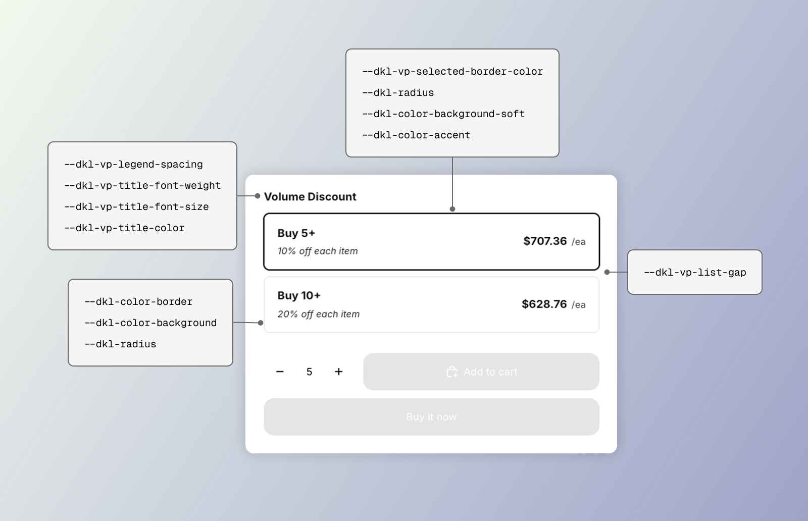 CSS styling tokens for the DKL Volume Picker component - layout: cards
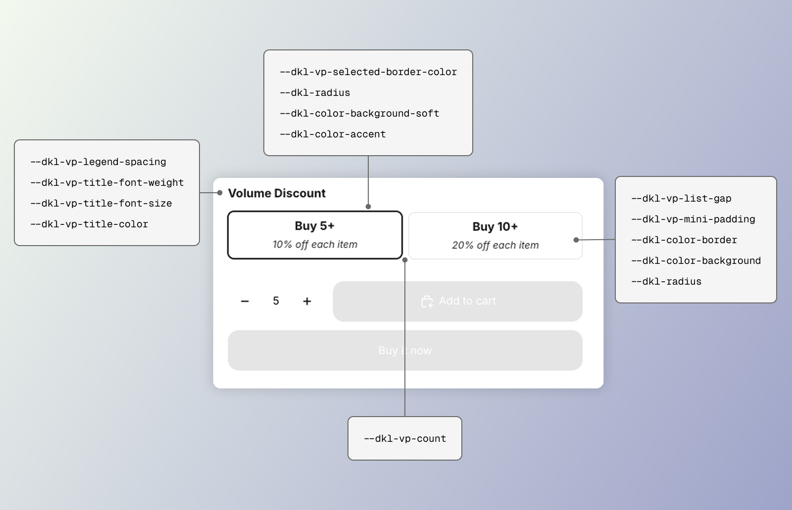 CSS styling tokens for the DKL Volume Picker component - layout: mini-buttons
Two layers: a shadow <style> for the title/list structure, and the light-DOM card chrome
in the stylesheet. The card chrome mostly consumes the
global brand tokens so cards match the theme.
Structure
Section titled “Structure”--dkl-vp-legend-spacing
Section titled “--dkl-vp-legend-spacing”default: 0.75rem
Space below the title row.
--dkl-vp-title-font-weight
Section titled “--dkl-vp-title-font-weight”default: 600
Group title font weight.
--dkl-vp-title-font-size
Section titled “--dkl-vp-title-font-size”default: 0.95rem
Group title font size.
--dkl-vp-option-title-font-size
Section titled “--dkl-vp-option-title-font-size”default: 15px
Tier heading inside each option (“Buy 2+”).
--dkl-vp-discount-font-size
Section titled “--dkl-vp-discount-font-size”default: 13px
Discount line inside each option (“20% off each item”).
--dkl-vp-price-font-size
Section titled “--dkl-vp-price-font-size”default: 15px
Per-option price.
--dkl-vp-unit-font-size
Section titled “--dkl-vp-unit-font-size”default: 13px
Unit suffix after the price (“/ea”).
--dkl-vp-title-color
Section titled “--dkl-vp-title-color”default: inherit
Group title color.
--dkl-vp-list-gap
Section titled “--dkl-vp-list-gap”default: 0.5rem
Gap between options.
--dkl-vp-count
Section titled “--dkl-vp-count”default: tier count (max 3)
Mini-buttons grid columns.
--dkl-vp-mini-padding
Section titled “--dkl-vp-mini-padding”default: 0.375rem 1rem
Mini-buttons option padding.
--dkl-vp-selected-border-color
Section titled “--dkl-vp-selected-border-color”default: #000000
Border and ring of the selected tier.
--dkl-color-border
Section titled “--dkl-color-border”default: rgba(0,0,0,.12)
Resting card border.
--dkl-radius
Section titled “--dkl-radius”default: 8px
Card corners.
--dkl-color-background
Section titled “--dkl-color-background”default: #fff
Card background.
--dkl-color-background-soft
Section titled “--dkl-color-background-soft”default: rgba(0,0,0,.04)
Hover background.
--dkl-color-accent
Section titled “--dkl-color-accent”default: #217a4a
Focus-visible outline.
CSS parts and classes
Section titled “CSS parts and classes”The title/list scaffold is in shadow DOM (parts); the radio cards are slotted light DOM (classes).
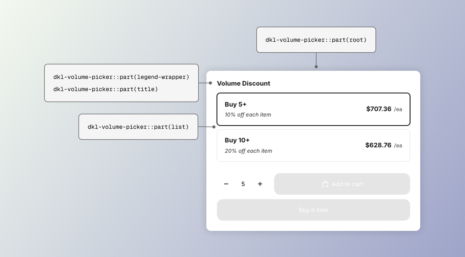 CSS parts for the DKL Volume Picker component - layout: cards
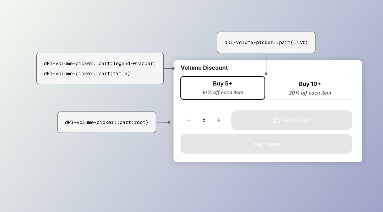 CSS parts for the DKL Volume Picker component - layout: mini-buttons
CSSPart
The <fieldset> wrapper.
legend-wrapper
Section titled “legend-wrapper”CSSPart
The title row.
CSSPart
The <legend> group title.
CSSPart
The radiogroup holding the options.
Light-DOM classes
Section titled “Light-DOM classes”.dkl-volume-picker__option
Section titled “.dkl-volume-picker__option”class
One tier card (selected: :has(.dkl-volume-picker__radio:checked)).
.dkl-volume-picker__radio
Section titled “.dkl-volume-picker__radio”class
The radio input.
.dkl-volume-picker__content
Section titled “.dkl-volume-picker__content”class
Card inner row.
.dkl-volume-picker__header
Section titled “.dkl-volume-picker__header”class
Title + discount stack.
.dkl-volume-picker__title
Section titled “.dkl-volume-picker__title”class
Tier heading (e.g. “Buy 3+”).
.dkl-volume-picker__discount
Section titled “.dkl-volume-picker__discount”class
The “X% off each” line.
.dkl-volume-picker__price
Section titled “.dkl-volume-picker__price”class
Per-tier price.
.dkl-volume-picker__price-unit
Section titled “.dkl-volume-picker__price-unit”class
The unit suffix (e.g. “/ea”).
.dkl-volume-picker__price-unavailable
Section titled “.dkl-volume-picker__price-unavailable”class
“No discount” placeholder.
Examples
Section titled “Examples”:root { --dkl-vp-selected-border-color: #2563eb;}:root { --dkl-vp-list-gap: 0.25rem; --dkl-vp-title-font-weight: 700;}<dkl-volume-picker-radio-groups data-style="mini-buttons" style="--dkl-vp-mini-padding: 0.25rem 0.75rem;"></dkl-volume-picker-radio-groups>