Discount Badge
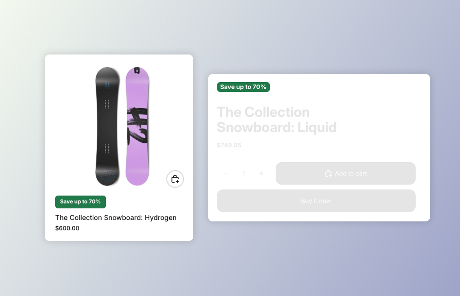
DKL Discount Badge component
<dkl-discount-badge> is a theme-agnostic “max discount” badge — e.g. Save up to 20%
or Save up to $5.00. It’s a light-DOM component: the label is the element’s own
text content (no shadow DOM), and the host element itself is styled as the badge. That
keeps it dropping cleanly into a product card and painting from server-rendered markup.
The amount comes from the product’s max_reward_percent / max_reward_cents metafields:
max_reward_percent— a decimal percent, rounded to a whole number (19.6 → 20%);max_reward_cents— an integer, formatted as money via the shop’s money format.
Which one shows is chosen by data-discount-type — the percent, the cents, or highest
(whichever saves more). The visible text is server-rendered, so it paints immediately; the
component is an optional enhancement that re-composes the label and re-picks the highest
option on a variant change.
On this component
Section titled “On this component”App blockAdd DK: Discount Badge in the theme editor and configure it with settings — no code. The only way to render in collection product cards.
Web ComponentsDrop dkl-discount-badge straight into your theme's Liquid and configure with data-*.
Styling & Data AttributesThe data-* attributes and --dkl-badge-* styling tokens shared by both.
EventsThe mount / unmount lifecycle events each instance emits.
Accessibility
Section titled “Accessibility”- Real text. The badge is plain, server-rendered text (e.g. “Save up to 20%”) — not an image or a CSS background — so screen readers read it verbatim and it scales with browser zoom and text-size settings.
- No empty announcements. When nothing applies, the component hides the host entirely rather than leaving an empty element for assistive tech to encounter.
- Contrast. Because the badge colours are merchant-configurable, keep
--dkl-badge-colorand--dkl-badge-backgroundat a sufficient contrast ratio when restyling.