Styling & Data Attributes
This is the shared reference for <dkl-discount-badge> — the data-* attributes that drive
its behaviour and the --dkl-badge-* tokens that style it. The app
block settings map onto these; on a web component
you set them directly.
Data attributes
Section titled “Data attributes”All optional — the carrier (or your own Liquid) supplies them. Set one to override.
data-discount-type
Section titled “data-discount-type”"percentage" | "fixed" | "highest" · default: percentage
Which amount to show — the percent, the cents, or whichever saves more. highest is
computed against the current variant price (percent × price vs the fixed cents); ties
favour the percentage, and a missing side falls back to the other.
data-amount-percent
Section titled “data-amount-percent”number (decimal percent) · default: carrier (max_reward_percent)
The percentage amount (rounded for display).
data-amount-cents
Section titled “data-amount-cents”int (cents) · default: carrier (max_reward_cents)
The fixed amount (money-formatted).
data-base-price-cents
Section titled “data-base-price-cents”int (cents) · default: carrier (the variant's price)
The variant price; drives the highest comparison (recomputed on variant change).
data-money-format
Section titled “data-money-format”string · default: carrier (shop.money_format)
Money format for the fixed amount.
data-label
Section titled “data-label”string · default: Save up to [amount]
Label template; [amount] is replaced with the formatted amount.
CSS styling tokens
Section titled “CSS styling tokens”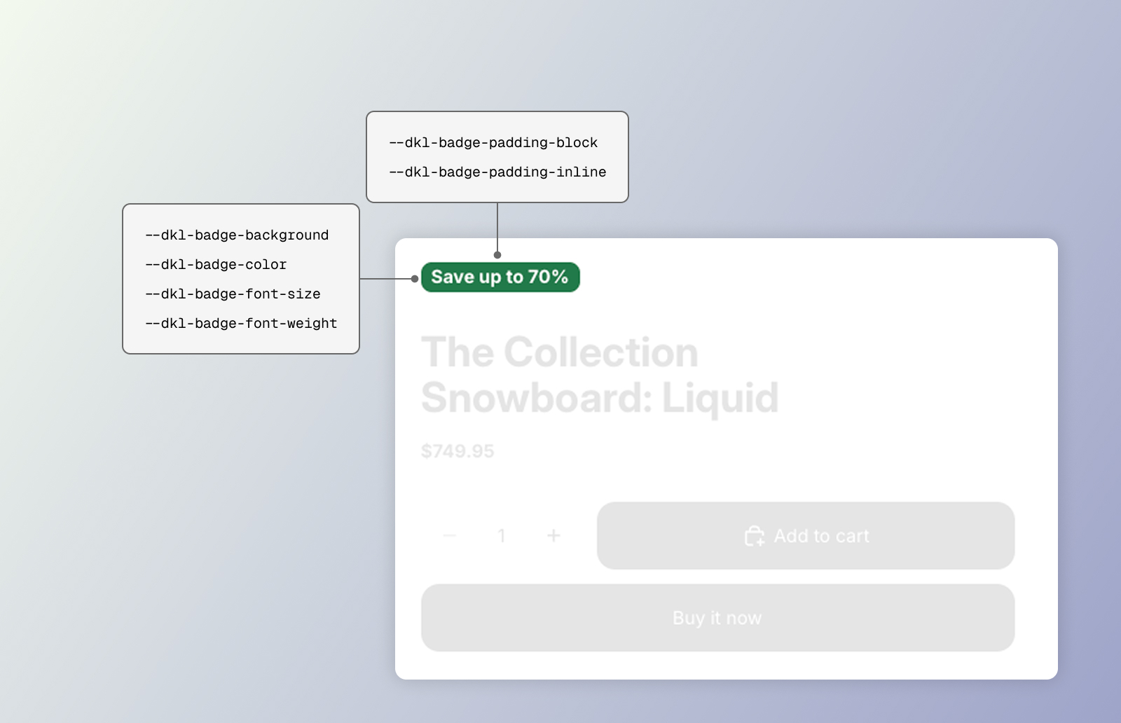
CSS styling tokens for the DKL Discount Badge component
The stylesheet (loaded site-wide by the embed) styles the host element directly — the
host is the badge, so target dkl-discount-badge { … } (there are no CSS parts). Set any
token above the element — :root, the embed’s Custom CSS, an inline style, or the block’s
scoped rule.
--dkl-badge-background
Section titled “--dkl-badge-background”default: var(--dkl-color-accent)
Badge background.
--dkl-badge-color
Section titled “--dkl-badge-color”default: #ffffff
Badge text.
--dkl-badge-radius
Section titled “--dkl-badge-radius”default: var(--dkl-radius)
Badge corners.
--dkl-badge-padding-block
Section titled “--dkl-badge-padding-block”default: 0.175rem
Vertical padding.
--dkl-badge-padding-inline
Section titled “--dkl-badge-padding-inline”default: 0.5rem
Horizontal padding.
--dkl-badge-font-size
Section titled “--dkl-badge-font-size”default: 0.75rem
Badge text size.
--dkl-badge-font-weight
Section titled “--dkl-badge-font-weight”default: 600
Badge text weight.
The DK: Discount Badge block exposes Background color, Text color, Corner radius,
Vertical / Horizontal padding, Font size, and Font weight settings that feed the matching
tokens via a scoped <style> rule.
Examples
Section titled “Examples”<dkl-discount-badge style=" --dkl-badge-background: #111; --dkl-badge-color: #fff; --dkl-badge-radius: 999px; --dkl-badge-font-size: 0.85rem; --dkl-badge-font-weight: 700; "></dkl-discount-badge>:root { --dkl-badge-background: #111; --dkl-badge-color: #fff; --dkl-badge-radius: 999px;}dkl-discount-badge { letter-spacing: 0.02em; text-transform: uppercase;}